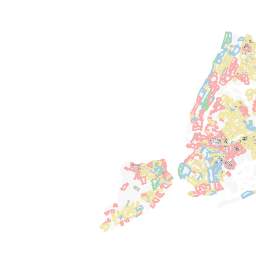
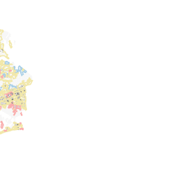
A - "best"
B - "still desirable"
C - "definitely declining"
D - "hazardous"
SOURCE:
A
B
C
D
Others
UPDATED Invalid date
This map shows the relationship of foreclosures, historical redlining maps, and the ethnic and racial composition of neighborhoods in New York City.
Data on foreclosures is derived from the Furman Center's Neighborhood Information, showing 1-4 family buildings that were in foreclosure in 2012 (meaning they have received foreclosure notices after not having made mortgage payments in 90 days).
The data on foreclosures is complemented by the "residential security" ratings (redlining maps) of the Home Owners Loan Corporation, using a data set by the University of Richmond's Mapping Inequality project. In addition, a racial dot map, using the American Community Survey data from 2014, with one dot representing 100 people, is made available.
Map by winkj601
UPDATED Invalid date
This map shows the relationship of foreclosures, historical redlining maps, and the ethnic and racial composition of neighborhoods in New York City.
Data on foreclosures is derived from the Furman Center's Neighborhood Information, showing 1-4 family buildings that were in foreclosure in 2012 (meaning they have received foreclosure notices after not having made mortgage payments in 90 days).
The data on foreclosures is complemented by the "residential security" ratings (redlining maps) of the Home Owners Loan Corporation, using a data set by the University of Richmond's Mapping Inequality project. In addition, a racial dot map, using the American Community Survey data from 2014, with one dot representing 100 people, is made available.
A - "best"
B - "still desirable"
C - "definitely declining"
D - "hazardous"
SOURCE:
A
B
C
D
Others