Urban Renewal, Redlining, and Public Housing in NYC
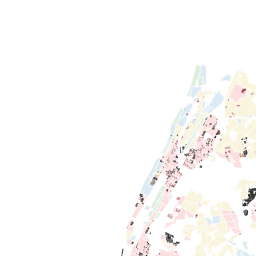
This map shows the interrelation between the federal government's practice of redlining, urban renewal plans and public housing construction in New York City.
In the 1930s, the federal government adopted racist lending practices from the real estate, banking, and insurance sectors, and institutionalized them as public policy. The Home Owner's Loan Corporation (HOLC) assessed the risk of their home loans in urban areas, producing "residential security maps" and rating areas from A ("best"), B ("still desirable"), C ("definitely declining"), to D ("hazardous"). These neighborhood ratings were almost entirely based on the presence of African Americans and other minority populations. As a result, D and C-rated areas were denied federal loans, as well as other public and private investments.
Urban renewal, a federal policy introduced by the Housing Act of 1949, made available federal funds to clear and rebuilt so-called "blighted" areas. As this map shows, urban renewal over-proportionally targeted areas that were first negatively affected by redlining. It heavily built on and reinforced the racist rationale of redlining, displacing hundred thousands of African Americans and minority populations throughout the next decades.
Public housing too, was created over-proportionally in prior red-lined areas. While urban renewal was legitimized through its "public use" (among them the promise to build public housing), only a small proportion of urban renewal plans was actually used to create public housing.
The data on urban renewal, public housing, and redlining is complemented by four racial dot maps of the years 1960, 1980, 2000, and 2014, which show the effect that these policies had on patterns of racial residential segregation in the city.
SOURCES:
Data on urban renewal plans is derived from the Urban Reviewer (http://www.urbanreviewer.org/)
Data on redlining is derived from the University of Richmond's "Mapping Inequality" project (https://dsl.richmond.edu/panorama/redlining/#loc=4/36.71/-96.93&opacity=0.8)
Data on NYCHA developments is derived from New York City's Open Data portal (https://data.cityofnewyork.us/Housing-Development/Map-of-NYCHA-Developments/i9rv-hdr5/data)
Data on the ethnic and racial breakdown of the population is derived from the Census Bureau (https://www.census.gov/) and the National Historical Geographic Information System (https://www.nhgis.org/).


Urban Renewal Plans per HOLC ratings
None selected
-
No results
Your search "" didn't match
with any value.Try searching again.
NYCHA Developments per HOLC rating
All selected
-
No results
Your search "" didn't match
with any value.Try searching again.
NYCHA in Urban Renewal per HOLC rating
None selected
-
No results
Your search "" didn't match
with any value.Try searching again.